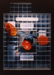
Housing Competition – Alaska
A competition with a heavy bias on sustainability issues, the design reached the third stage of final 20 schemes. This scheme had at its core the reuse of shipping containers as house enclosure as well as water storage and transportation enclosure.
Photography: Roger Long

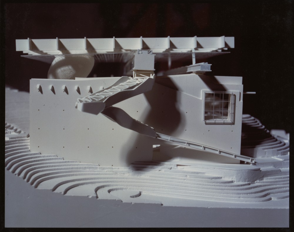
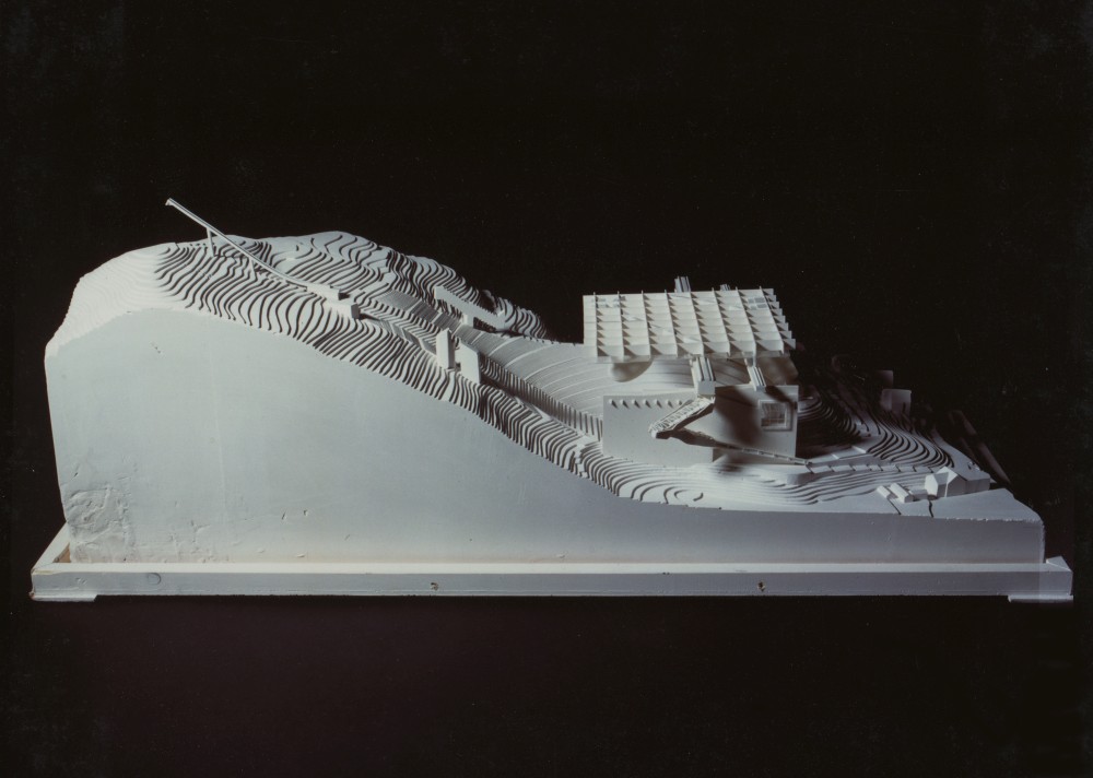
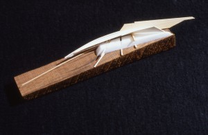
Ron Herron – Ski Jump Competition
A competition for a combination winter ski jump and summer Expo setting in Austria.
Photography: Simon Herron
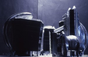
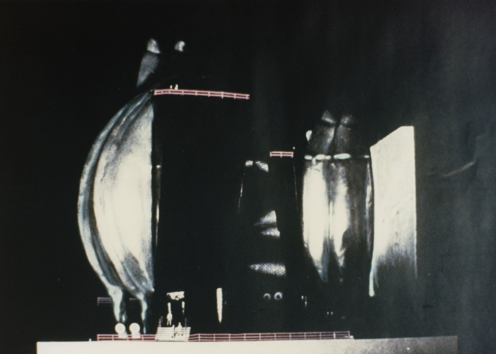
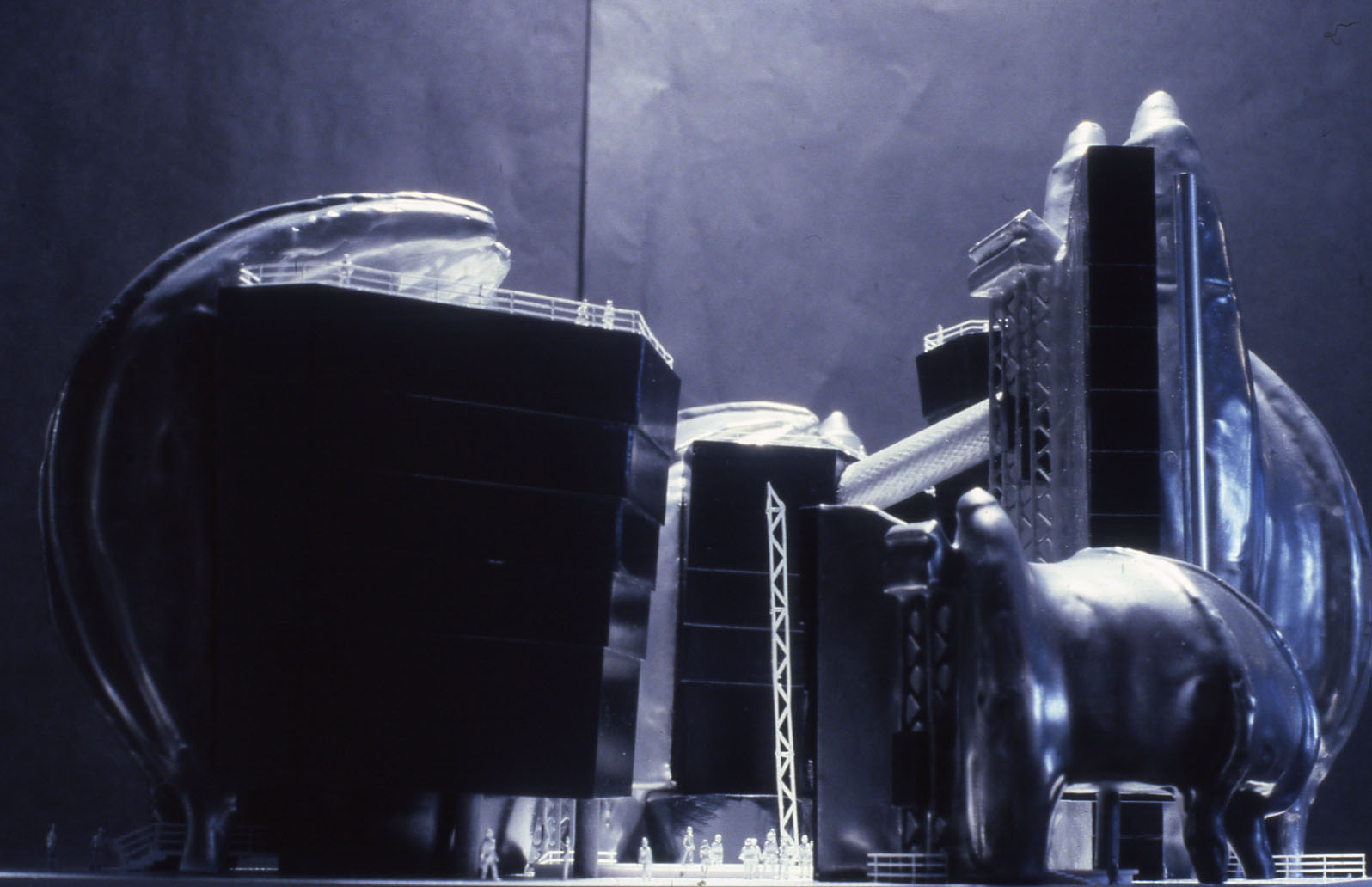
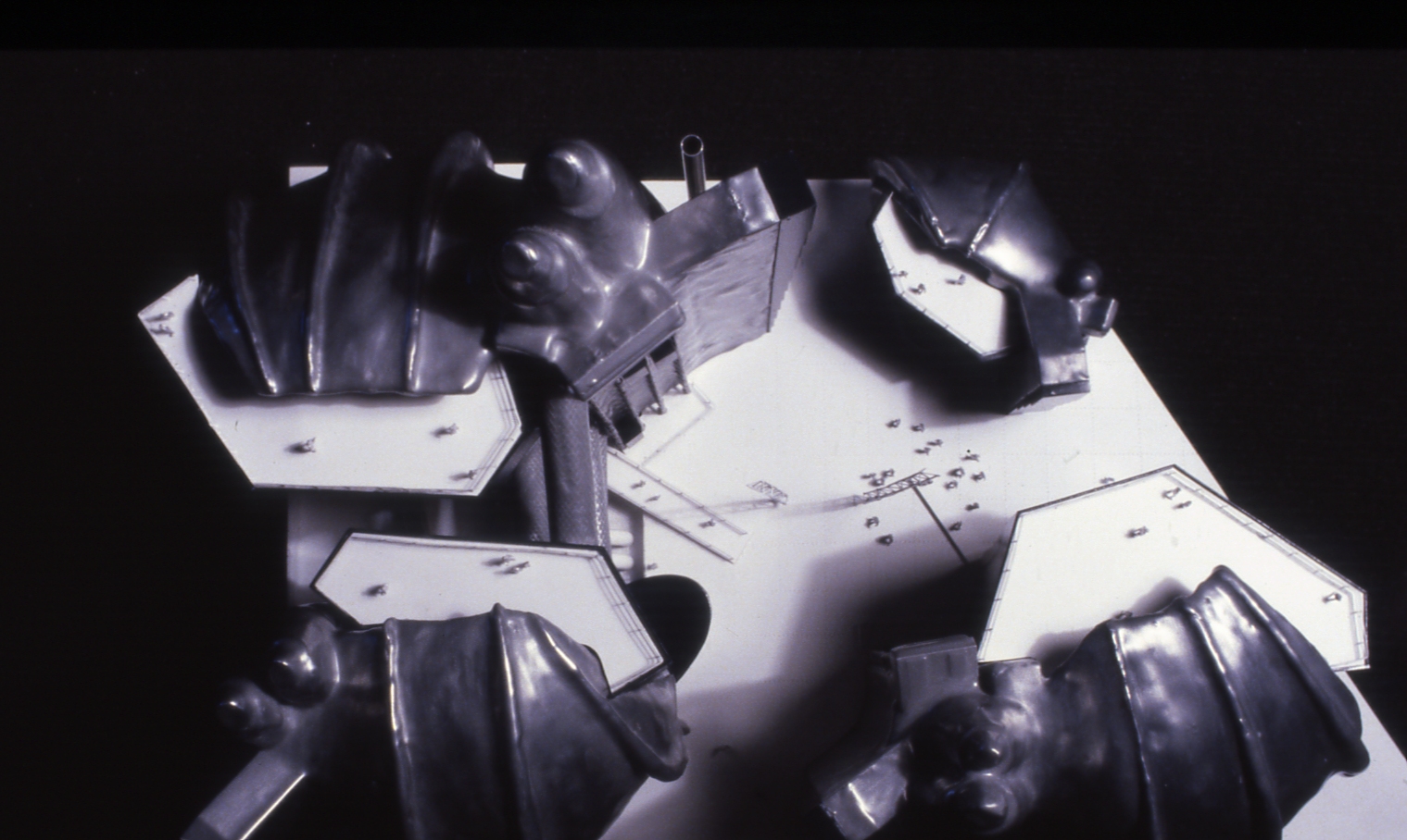
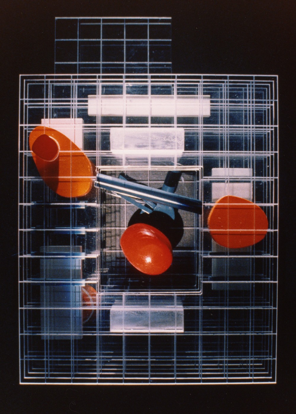
Ron Herron – L’Oreal Headquarters Competition
The model really demonstrates the idea of hands holding precious crystals as the main theme in the competition entry for this adventurous cosmetics firm’s headquarters. The use of cold cast aluminum poured over a mold and then burnished with warm tones transforms the metal into a very tactile surface into which are set hard edged crystalline forms of acrylic. This dynamic illustrated Ron’s ideas in a very powerful way.
Photography: Simon Herron
Walking City, London
Ron’s Birthday cake linking his work with Archigram and the Walking City ideas and his penchant for marzipan Christmas cakes.
Photography: Simon Herron

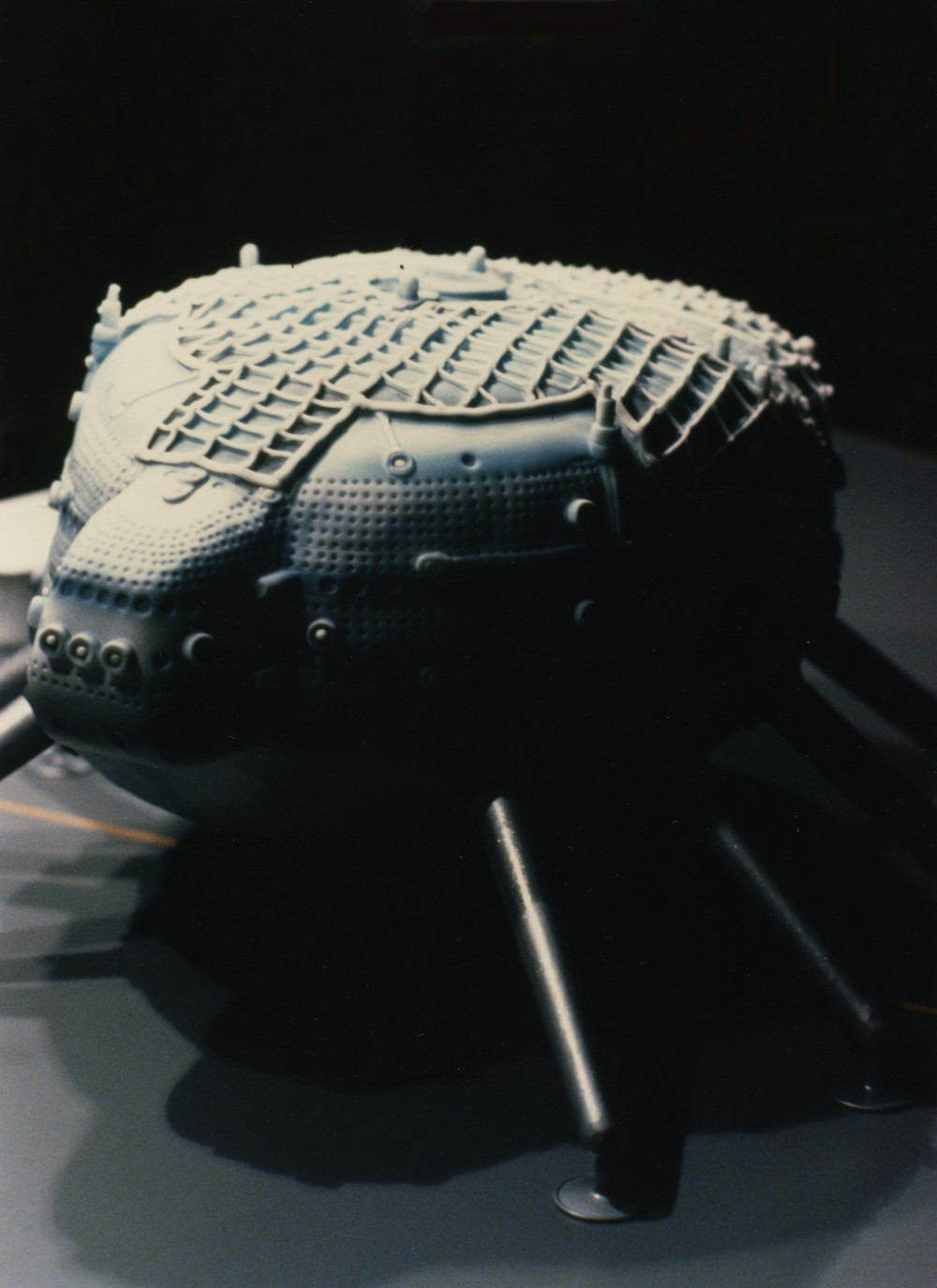
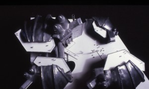
SOM – Telecom Asia Competition, China
A very small (4″ tall) model of an idea for the Headquarters of this Telecommunications giant in Asia, lit by a small battery powered LED. It came in its own visually impenetrable wooden box and unveiled at the boardroom table to much surprise and delight.
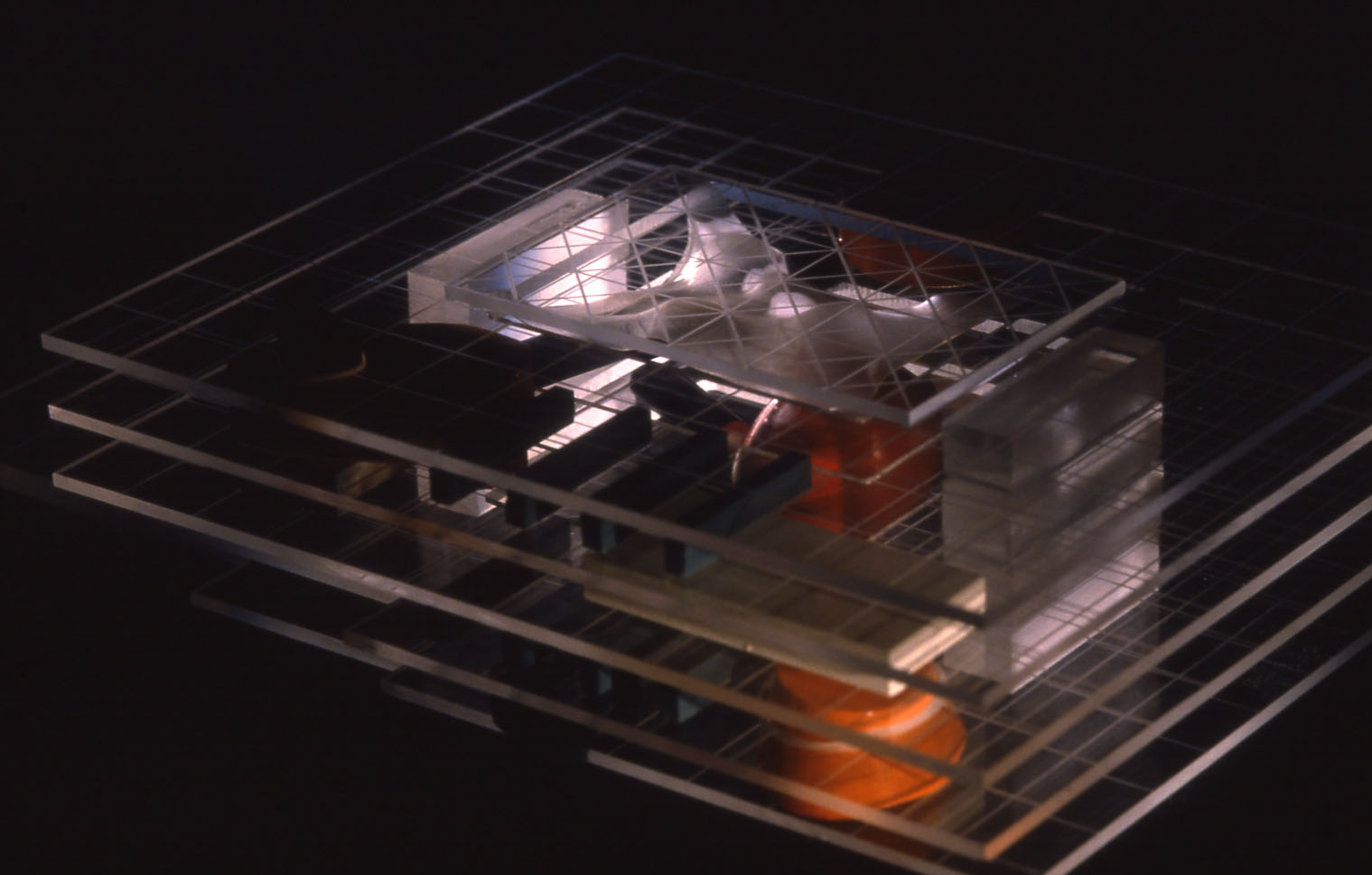
Ron Herron – Repsol Competition, Spain
A competition entry for a Spanish Fuel Company’s new Headquarters. Ron proposed that the existing 60’s concrete structure be stripped and pared down to just the floors and columns. He would then inhabit that structure with a series of new program pieces inserted at various intervals.
Photography: Simon Herron
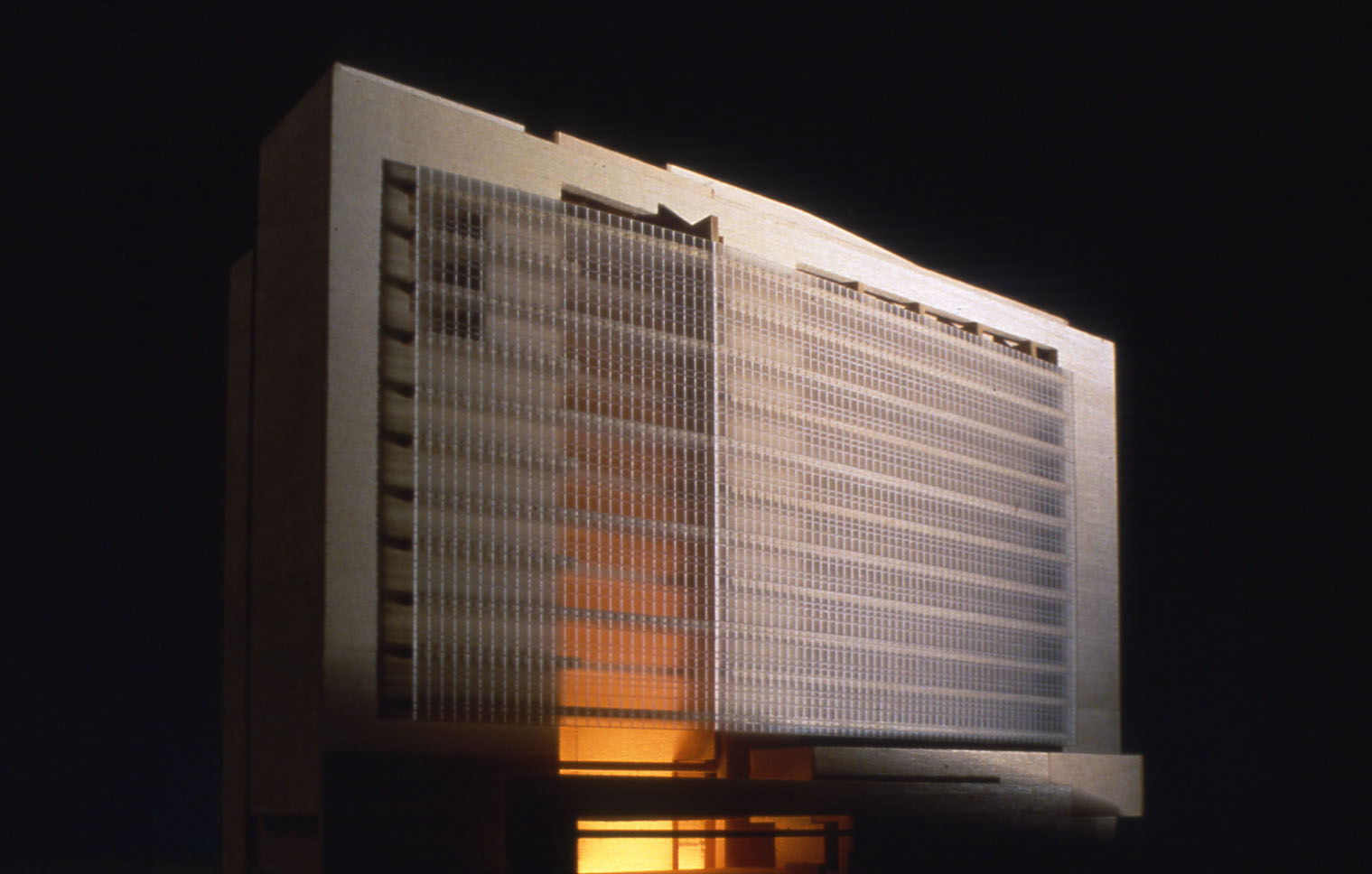
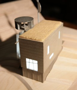
NBBJ – Reebok World Headquarters, Stoughton, Mass.
First in a series of simple models produced to guide the design intent and start to create a dialogue with the apparel designers that were going to inhabit the building.
Photography: Alec Vassiliadis
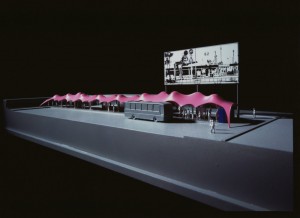
Ron Herron – The Pink Cloud Bus Station, Kyoto, Japan
Ron designed an elegant and simple tensile structure for this bus/train interchange station for an expo in Japan. Ron wanted something really cool and punchy for the tent colour and chose this vivid pink which caused quite a stir at the client meeting. Upon being asked why the pink, he replied that it symbolized the colours of a setting sun upon a cloud. His clients loved the idea and the colour was faithfully reproduced for the tensile structure which was then up lighted so it would glow at night.
Photography: Alec Vassiliadis
Architectural, industrial design, Art, Legal Models